Decked out and almost ridiculous looking vending machines have become an intense promotional tool for all sorts of brands, for them to create brand awareness. Social media stunts and zany promotions are all the craze with these machines, illustrating just how creative one can be with the contents of a typical vending machine.
We’re almost to the point where if you see one outside it’s natural habitat, you assume it’s going to do something out of the ordinary if you just wait…and wait a little longer.
Canadian agency Taxi noticed this trend and decided to take an unlikely stance on the stunt fad on hand, in this video.
Take a look below as unsuspecting passersby encounter this mysterious machine, and how they react.
Let us know how you would have reacted in this vending machine stunt to end all vending machine stunts to date!
https://www.frontseat.co.za/wp-content/uploads/2015/05/tweettoeat.jpg427640mulalo siminyahttp://www.frontseat.co.za/wp-content/uploads/2015/09/frontseat-logo.pngmulalo siminya2015-05-13 12:37:002019-10-23 09:41:40Just Another Vending Machine Stunt
Don’t come looking for the iPhone 6 or even that gorgeous new Macbook pro round these parts…nope, This Apple store doesn’t have all that. This one here’s the Real Apple Store, because it actually sells REAL apples. London’s Borough Market, one of the oldest markets in the U.K, just marked it’s 1000th year. As part of the celebrations, it treated shoppers to a delightful concept – ‘A Real Apple Store”for a weekend, which was a clever copy of the iconic Apple retail store. Actual apples were on display on transparent pedestals just like an iPhone or iPad would be featured in the actual technological store. Instead of technical specs, the signs showed each apple’s unique flavour notes and history. At least one didn’t have to worry about the 500 percent mark up on THESE apples.
https://www.frontseat.co.za/wp-content/uploads/2015/05/real-apple-store-hed-2014.jpg560784mulalo siminyahttp://www.frontseat.co.za/wp-content/uploads/2015/09/frontseat-logo.pngmulalo siminya2015-05-13 10:57:002019-10-23 10:58:04The Real Apple Store
An economic driver and sustainable symbol of hope.
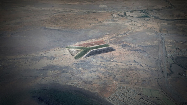
FCB South Africa is running an idea up the flagpole. A really big idea to bring a sense of hope and change to South Africans alike. It’s main component is the South african flag so large, it will be visible from Space! The Giant Flag project was put in motion by Guy Lieberman, the agency’s head of green and social new business development. This concept has been designed to foster national pride, improve the lives of people in need and make a lasting impact on South Africa’s economy and environment. So exactly HOW big is this flag project? The proposed flag will measure 66 hectares, which is almost the size of 66 soccer fields. It’s red, green, blue and gold sections will consist of millions of cacti and succulent plants that can thrive in the semi-arid Karoo region. Solar panels designed to power the equivalent of 4000 homes will make up the flag’s triangular black patch. (They will also “harvest” rainwater to feed the flag’s living components). The white areas of the flag will be access roads. Not only will the project be a massive one, but it will also provide more than 700 jobs in Camdeboo Municipality, where the unemployment runs over 40 percent, and support tourism, hospitality and various enterprises over the long haul. Lieberman says, this project will serve as a symbol of hope, cooperation and sustainable growth for South Africa and beyond.
But..where did the whole giant-flag idea sprout from?
Lieberman drew his inspiration from the 2010 FIFA World Cup in South Africa, feeling it had an emotional impact the citizens of the country. After the World Cup, FCB launched the much -praised “Keep Flying” campaign to encourage the nation to maintain its momentum. Eager to find another project that would simply keep the campaign going the Giant Flag idea was born.
Of course, a 66-hectare flag can’t be built on the cheap. What’s the price tag, and who’s footing the bill?
Crowdfunding and corporate efforts are under way. It will cost about $20 million (R200 million), with $2 million (R20 million) being the threshold to begin the massive germination project, followed by clearing the land, fencing off the site, building roads and constructing the solar field. “There has been half a million dollars sunk to date,” says Lieberman, “and a variety of commitments, soft to definitive, of around $6.5 million.”
Individuals can donate $10 to sponsor a plant, $100 for a section of road and $250 for a solar panel. What’s more, South Africa’s Department of Environmental Affairs is lending its support, and corporate sponsors such as Google and Toyota “have come on board because they see the value this will have on the nation, as well as on their brand,” Lieberman says. (Google is providing a monthly $10,000 AdWords grant to promote the project, as well as cloud services for the Giant Flag app.)
https://www.frontseat.co.za/wp-content/uploads/2015/05/The-Big-Flag.jpg377706mulalo siminyahttp://www.frontseat.co.za/wp-content/uploads/2015/09/frontseat-logo.pngmulalo siminya2015-05-11 12:56:002019-10-23 09:41:03South African Flag Visible From Space
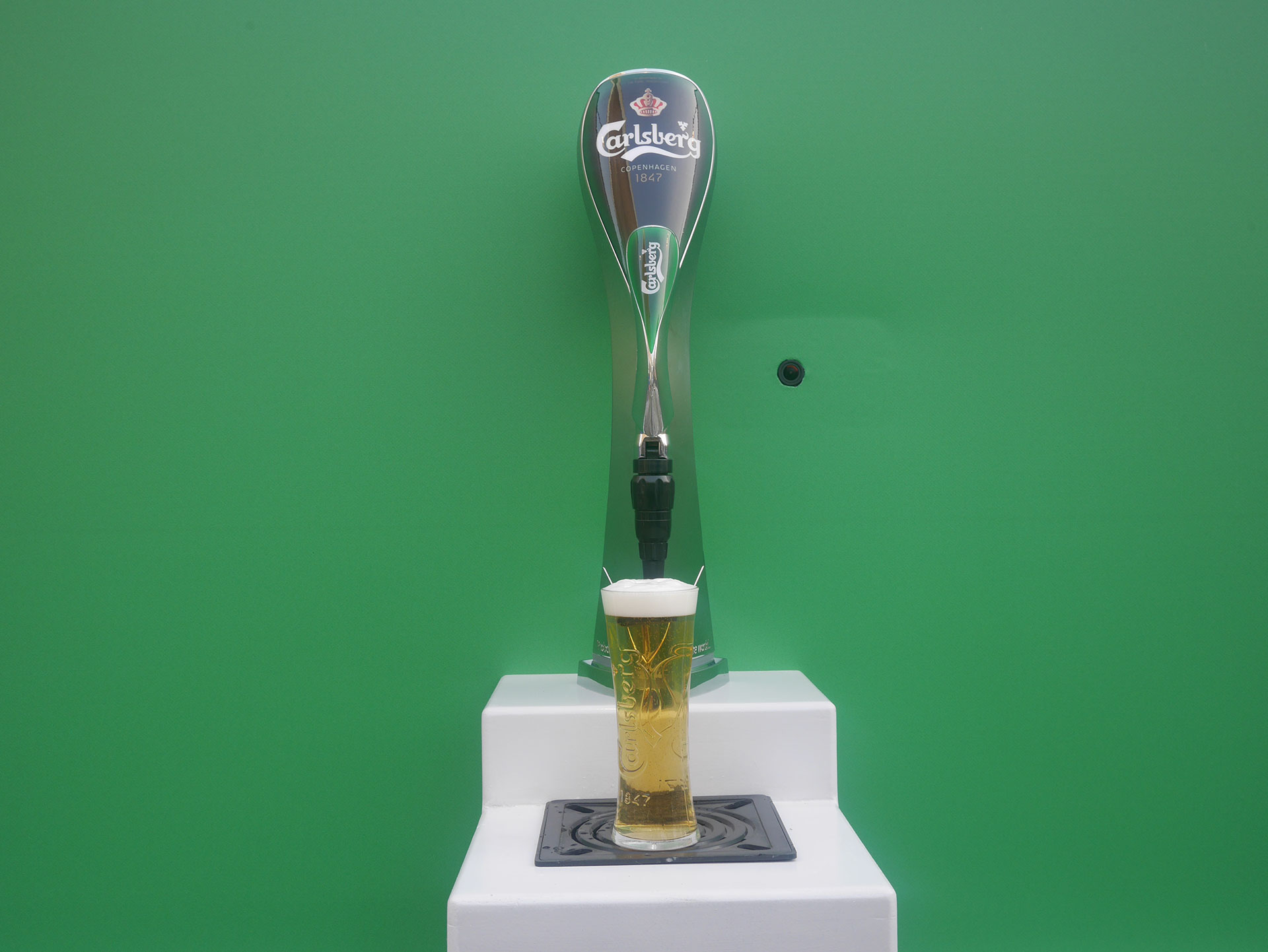
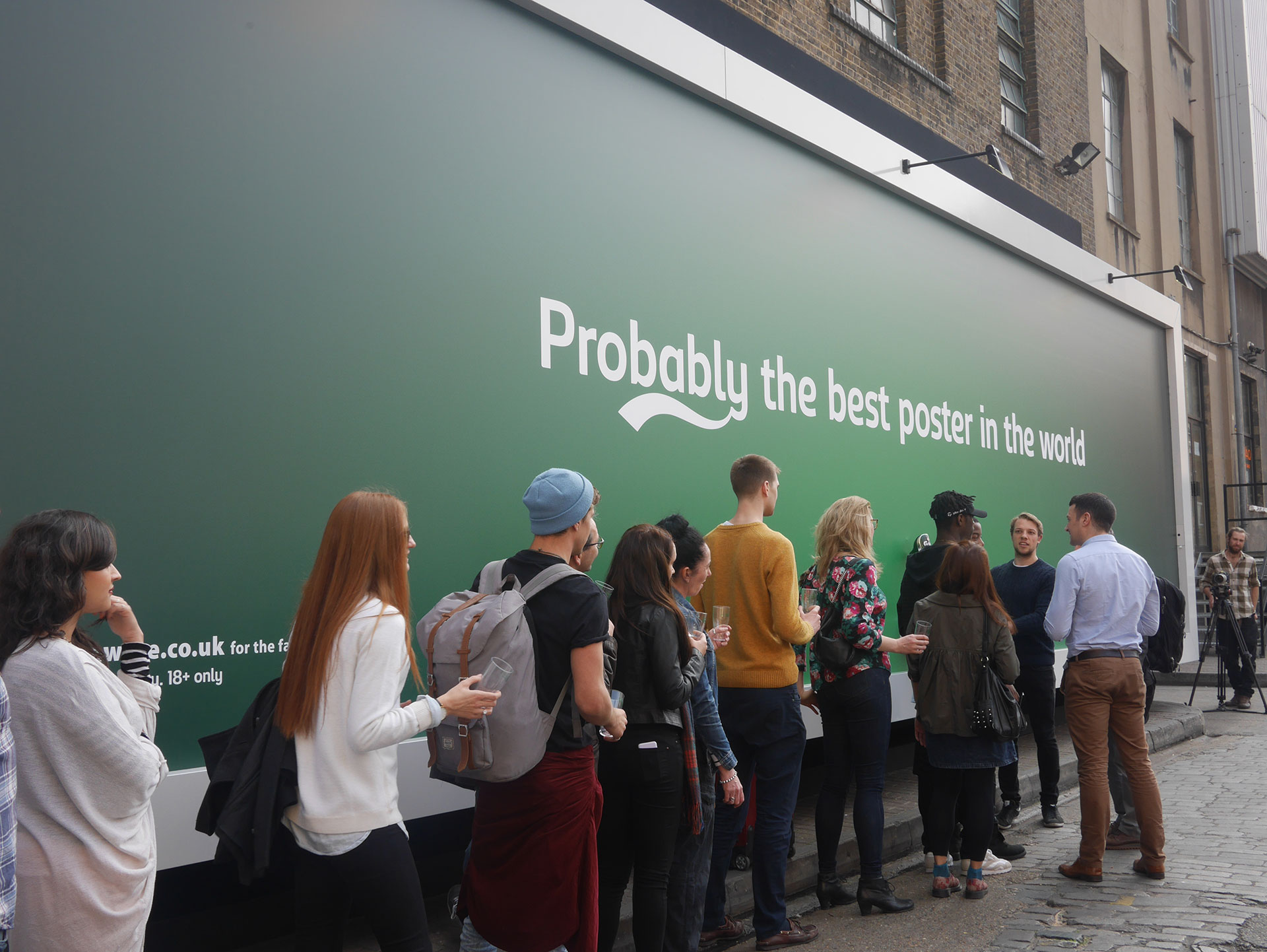
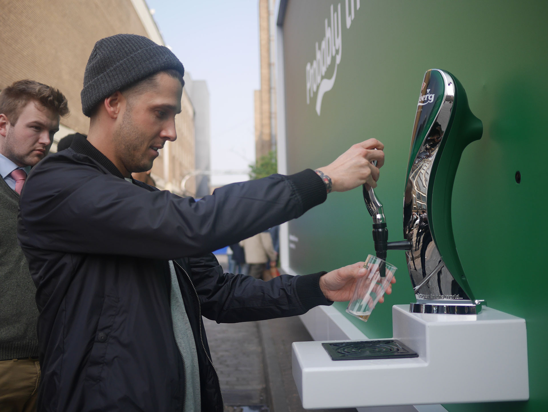
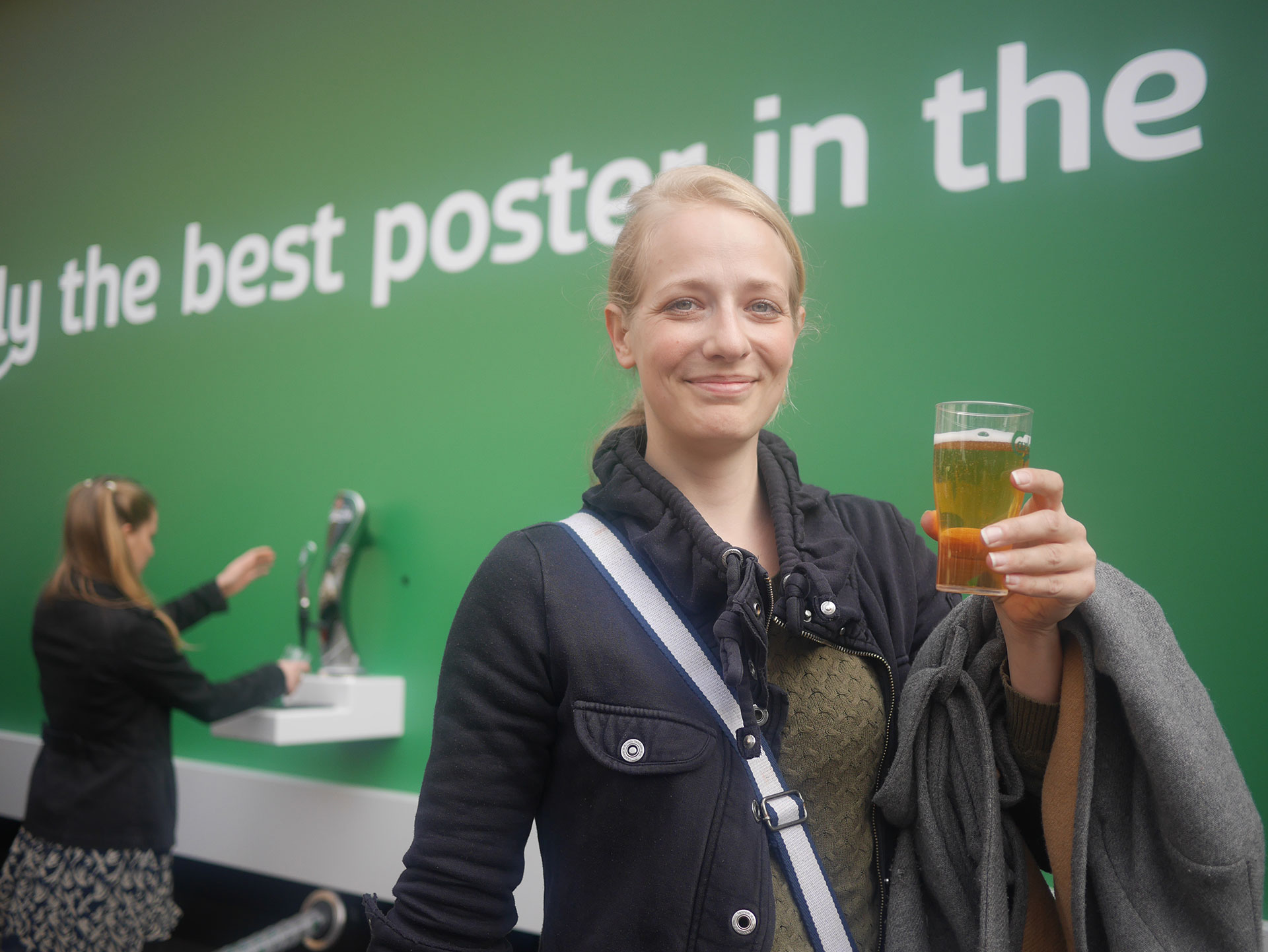
Help yourself to a cheeky pint! We all thought the Coke Zero drinkable billboard was an ultimate winner, but now Carlsberg is serving some outdoor advertising with an age limit. The Danish brewer, with help from an ad agency called Fold7 and design company Mission Media, unveiled a beer-dispensing billboard at The Old Truman Brewery on Brick Lane in London. The billboard sported the headline “Probably the best poster in the world”, and fulfilled exactly that notion, as a people poured in from all over the streets to have their pint. The brand was also on hand to monitor the drinkers, making sure no one was under the age of 18.
“We want to get the Carlsberg brand in front of as many beer drinkers as possible,” says Dharmesh Rana, senior brand manager at Carlsberg U.K. “To do this, we have to think differently with our approach and can’t just rely on great TV advertising.”
Now this is what I call successful advertising! Not only did the brand manage to create a great amount of awareness, but they helped ‘happy hour ‘ spread across the city of London.
https://www.frontseat.co.za/wp-content/uploads/2015/05/carlsberg-billboard-hed-2015.jpg11211920mulalo siminyahttp://www.frontseat.co.za/wp-content/uploads/2015/09/frontseat-logo.pngmulalo siminya2015-05-08 11:38:002019-10-23 09:39:02A Billboard That Makes You Drunk
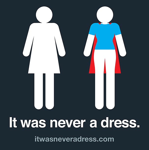
The universal sign for bathroom signs is typically a man in pants and a woman in a dress, to indicate the difference and make life easier! But what if the female sign wasn’t even a dress to begin with…and the man could be naked for all we know. lol
Tania Katan of Axosoft aims to change the way we look at ladies’ room signs. To many, if not ALL of us it typically looked like an abstract outline of a woman in a dress, but #ItWasNeverADress, launched by Tania, reimagines it as a woman in a cape!
It is an “invitation to shift perceptions and assumptions about women and the audacious, sensitive and powerful gestures they make every single day”. The studies are also meant to empower women and encourage them to join the IT industry.
Here we have Tania, standing beside the campaign cut out that speaks volumes and changes our way of thinking.
https://www.frontseat.co.za/wp-content/uploads/2015/05/55478642ecad043c1cbaa38c.jpg11001100mulalo siminyahttp://www.frontseat.co.za/wp-content/uploads/2015/09/frontseat-logo.pngmulalo siminya2015-05-04 09:06:002019-10-23 09:33:11It Was Never A Dress
All the futuristic fun was taking place earlier this week in Downers Grove, Illinois..hmm why does America get all the fun? Anyway..The McDonalds fast food franchise took the initiative in testing out a cool new ordering concept called ‘Create Your Taste’.
This is an experience quite different to your regular fast food joints, let alone any other McDonalds restuarant. It’s fast food with much more emphasis on the ingredients – the beef is cooked differently and cooked to order, with a customised array of condiments and sides that require you to actually sit down and wait for your order.
The lame part is obviously the waiting, as we all know the word ‘fast’ in fast -food actually means something quite literal..BUT the reason why this concept is cooler than most, is the entire process of ordering the meal via a large touch screen which greets you immediately upon entering.
The above pictures depict how the screen is used and how easy it is to add ingredients to your customised meal. The variety of choices is unbearably large, as one has to consider the type of bun, kind of sauce, type of cheese and even foods that wouldn’t be found at a regular McDonalds.
This was merely a technology test to elaborate on the wonderful future of user friendly and customised service. It will obviously take some time to create a more fast-paced set up so as to not gather frustrated customers at each outlet.
I feel McDonalds is heading the right way with this concept and one can look forward to a more ‘gourmet’ filled hamburger, like the amazing one below reminding me that lunch time is around the corner.
https://www.frontseat.co.za/wp-content/uploads/2015/04/mcdonalds_2.jpg__640x360_q85_crop_subsampling-2.jpg360640mulalo siminyahttp://www.frontseat.co.za/wp-content/uploads/2015/09/frontseat-logo.pngmulalo siminya2015-04-21 09:33:002019-10-23 09:37:53Mickey D's Goes Digital
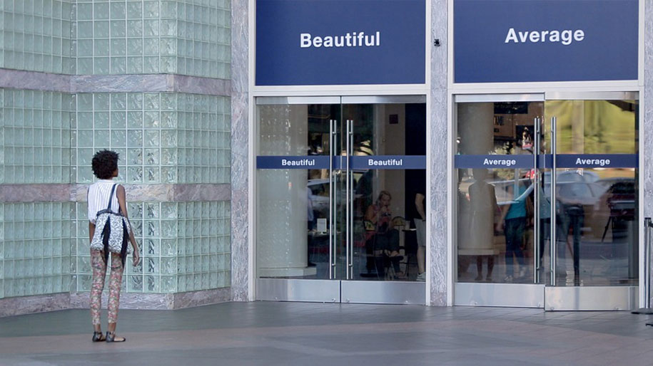
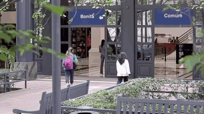
What if upon entering a building you were asked to choose what category you would fall under…Beautiful or Average?. Would you choose correctly or according to society? Do you feel beautiful?
That’s what Dove explored with their globe trotting campaign – ‘Choose Beautiful’. It was a follow up to their survey that indicated that 96% of women (in the world) rate themselves as ‘average’. Dove basically put signs on doors into public buildings in five cities around the world; Shanghai,San Francisco, London, Sao Paulo and Delhi. One door was labeled ‘Beautiful’ whilst the over stated ‘Average’, and believe it or not the majority of women chose to view themselves as average.
Dove went on to film the women’s reactions as the campaign progressed. The result? A lot of women were either frazzled, unsure and decided to either play it safe or merely view themselves that way naturally. Some women even went so far as to not enter the building at all!
Dove then did small interviews with the women, who confessed that choosing to go through the ‘average’ door had negatively impacted their self-esteem. Going through the ‘beautiful’ door required some guts, yet made them feel better about themselves afterwards. The message of the Dove Campaign was: Only women themselves can choose to feel beautiful and the door is a powerful visual tool to deliver this message.
https://www.frontseat.co.za/wp-content/uploads/2015/04/dove-choose-beautiful-social-600.jpg314600mulalo siminyahttp://www.frontseat.co.za/wp-content/uploads/2015/09/frontseat-logo.pngmulalo siminya2015-04-17 12:17:002019-10-23 09:35:34What Would You Choose?
“When the cat’s away the mice come out to play”- an old saying that basically means once the boss leaves, everyone comes out of their hiding places to act as casual and free as can be. These employees transformed their office from boring to quirky while their “cat” was away.
Majority of us dream of the luxury of getting to work and finding a work space that’s colourful, comfortable and enjoyable to be in, because we see our colleagues and work desks more than we see our own families, so a place that’s not as depressing is always a good idea!
Ben Brucker got his coworkers to decorate their plain office walls with superhero murals, but not just any kind of murals, he created Post- It murals!!
The use of sticky paper notes known as Post-its were used in creating full wall murals of different animated characters. Over 8,024 pieces were used in an all day battle against boredom and bland walls. The idea works well in their environment as they are part of a creative agency. According to what he said to Reddit, it took Ben several weeks to plan and design the characters, who seem to resemble pixel art or giant pieces of Lego characters. He had full support as his boss not only allocated a $300 budget for materials, but also help put the murals up too!! Coolest boss ever! The reason post-its were used instead of something more permanent, is because the agency plans on moving in a few months. Let’s hope they leave these super awesome wall murals for the next company to envy.
Rainy Day Brand Activation Almost everyone loves the smell of rain but not the water damage that comes along with it. Seattle-based artist Peregrine Church wants you to enjoy wet sidewalks too, so he decorates them with graffiti that only appears when wet with rain. This kind of semi-magical trick is achieved through the use of superhydrophobic materials. Once the painting of the sidewalk is complete it remains dry and invisible, and after a rainfall or any contact with water, an awesome array of designs comes to life for citizens to enjoy.
Although the graffiti is temporary, the images can last up to 18 months and the superhydrophobic coating is non-toxic. The creation process is done similarly to regular graffiti, beginning with a stencil, then applying a coating wherever applicable, probably at night. This form of brand activation surely keeps passers by inquisitive and always aware of any form of art displayed on the sidewalk…I guess one can look forward to a rainy day now.
https://www.frontseat.co.za/wp-content/uploads/2015/04/09-EapMpHo.jpg24483264mulalo siminyahttp://www.frontseat.co.za/wp-content/uploads/2015/09/frontseat-logo.pngmulalo siminya2015-04-08 07:48:002019-10-23 10:05:23Rainy Day Brand Activation
Sitting down with low rise jeans carries the risk of one exposing their butt-crack for all to see, and the spectators are not enjoying such a sight, however this bus ad by Meredith’s Miracles and FCB Ad agency suggests that you show your butt to at least one person: a doctor.
This is a clever ad that is meant to raise colon cancer awareness. It’s the second deadliest cancer in the world. Checkups can help diagnose early symptoms and decrease the spread.
Meredith’s Miracles Colon Cancer Foundation works to spread awareness about colon and rectal cancer, as well as provide financial aid for young adults undergoing treatment for the disease. FCB Chicago is the ad agency that came up with this concept, that will hopefully spread the message across.
https://www.frontseat.co.za/wp-content/uploads/2015/03/Dark-blue-ribbon_Colon-cancer-awareness_shutterstock_418925278.jpg6671000mulalo siminyahttp://www.frontseat.co.za/wp-content/uploads/2015/09/frontseat-logo.pngmulalo siminya2015-03-31 12:03:002019-10-23 10:02:59Butt It's For A Good Cause